CAD
Computer Aided Design, using AutoCAD and other 3D Modelling Software.

CAD & DESIGN
Using CAD In Semester 1 & Changed To Graphic Design In Semester 2
DESIGN
Continuing As A Graphic Designer
Computer Aided Design, using AutoCAD and other 3D Modelling Software.
Using CAD In Semester 1 & Changed To Graphic Design In Semester 2
Continuing As A Graphic Designer
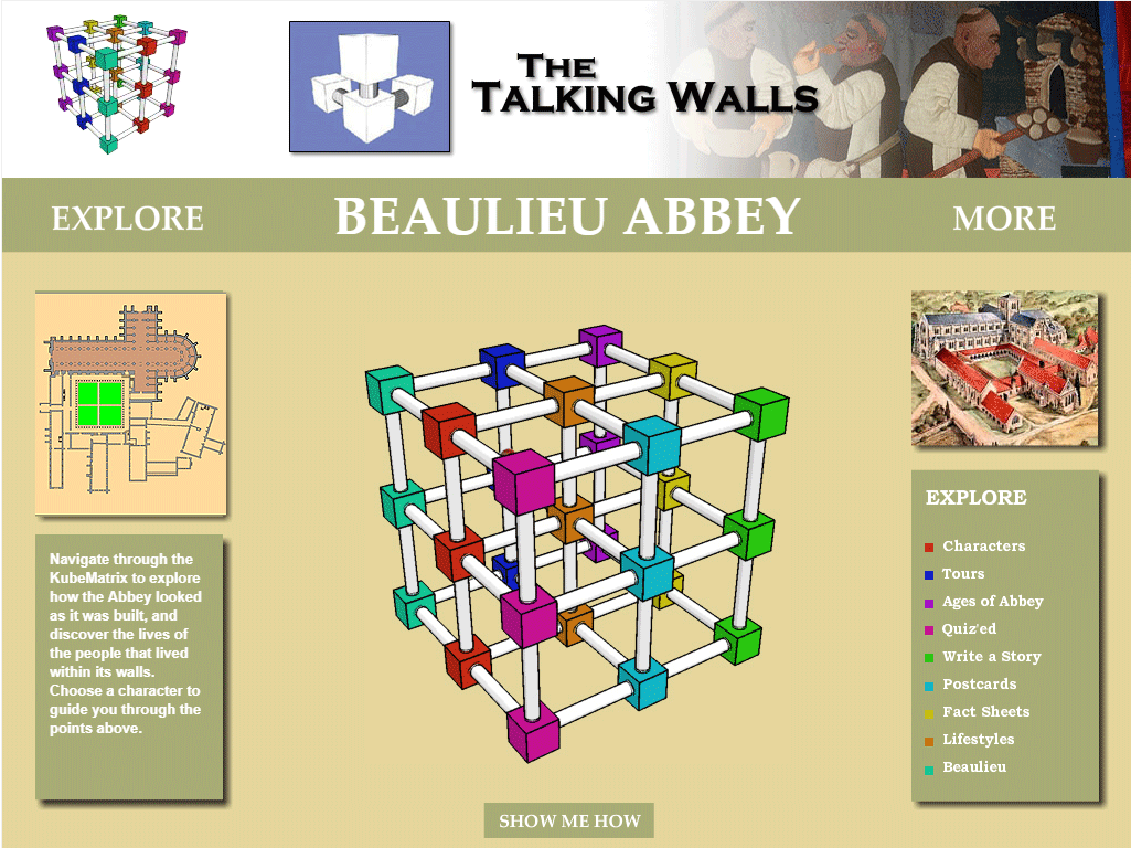
My client had stayed the same from the first semester. From my understanding, Beaulieu Abbey would like a new website because up until now, they've used flash on the website. As flash is coming to an end this year, it makes sense for them to upgrade to modern navigation system. They wanted a similar, fun way of navigating through the website. My ideation came from looking at creative CVs. I thought a circle graph shape with the text going round the inside of each segment. The circle key will replace the standard key you can see on the right of the screen. I thought this would be a clear way of directing people to the right part of the website.
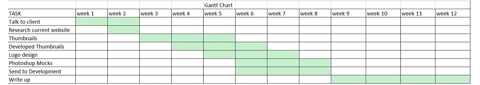
I created a Gantt chart to help manage my time over the 12 weeks. It allows me to keep track of my deadline and progress I made throughout the project.
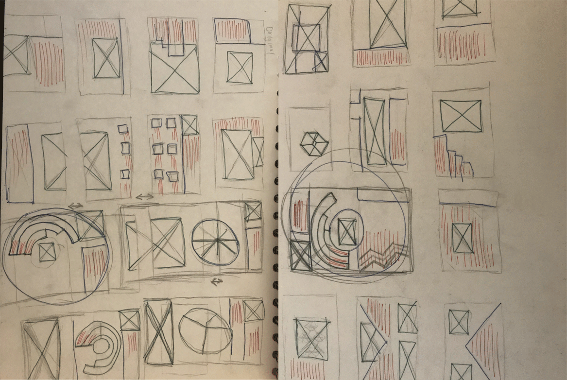
Here you can see my favoured thumbnails for this project. You can see my ideas on how to over come the old fashioned key/legend that was in the bottom right of the original webiste for the talking walls. My idea was to create a cirlce chart, with colour coordination making it an easier UI interface. The cube matrix was a key part of this design which needed to stay. As a designer I wasn't sure how to design around it and make it modern, my only suggestion would be to change the colour scheme.
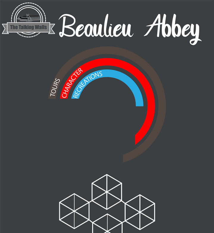
I tried to make my design as plain as possible whilst still looking modern compared to the original. The typeface was only a placeholder until I spoke again with the client. I had chosen the background colour because I think it is modern and easy on the eyes. Other elements on the page will easily stand out and the cube matrix will look great in all white. I thought the circle chart idea would’ve been a cool piece of coding that would be interactive for the audience, maybe moving and lighting up.
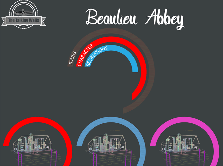
For the selection of buildings I designed this wireframe concept page. It has changed from another concept made by someone else. Their idea was the floor plans displayed on post-it notes. This idea was a quick fix and also fit the beige colour scheme. I feel my idea is more modern and will look good if we can manage to get the building 3D wireframes.
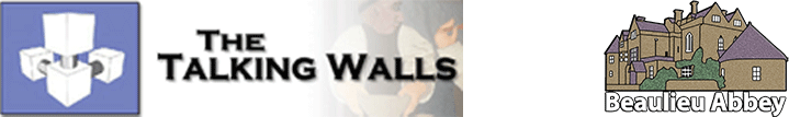
This is my logo design for the talking walls. The original logo didn’t resemble anything to do with the Abbey itself, just the cube matrix and the name. I went for a badge theme logo because I feel it will sit well in the corner of the screen, with the banner for the title. My colour choice was based on greys. I used white for the outlines to stand out against the dark background and grey to fill in the inside. My logo is a png, so I had to put it on a black background, My logo has a vector image of the abbey designed by Ice Wattangkura. I believe the freckle effect is modern and helps give the logo texture.
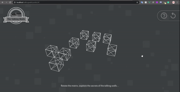
Continuing to work on this project with me was Lewis Raggett from Red Squirrel Studios. Lewis took charge on this project again being the developer. This was my first time sending designs to a developer to turn into code, and I found out the designs will always change. Lewis done really well at trying to stick with my theme and attempted to get my circle chart working. Unfortunately it was harder than expected to execute. I am pleased with how well Lewis has made the website look and how all the code is as modern as it gets. I understood this project was had a deadline due to the old website running on flash. I like the background lewis has made and as a designer, I completely forgot the moving background was possible, it gets my approval and I hope the client enjoys the modern look.
I have had more clients as a freelance designer this semester.
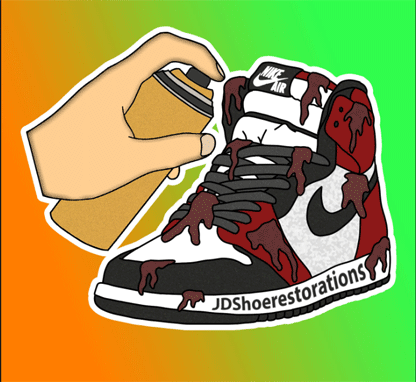
Another client I had this semester was JD SHOE Restorations. I met this client in person and discovered he would like a new logo. The logo he had was too complicated and didn't make sense to me. I could clearly see a spray can and dirt on the shoe. This indicates he either spray paints shoes or gets them even dirtier. After our meeting in the DMD studio, I understood his business more. He does restore shoes back to their glory, however shoe customisations are available (which is where the spray can came in).
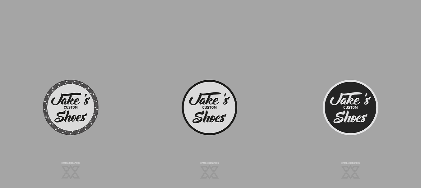
I spent hours thinking how I could fit “JD Shoe Restorations” into a logo, without it getting to complicated. I drew many thumbnails and finally came to the conclusion, the name is misleading. I would go on and develop these thumbnails into logos with a completely different name for the business. After showing him, he has confirmed the new name I made for the business. Jake’s Custom Shoes fit his business description and skill set much better. One technique I used as a development was creating my own stroke pattern on the adobe software. Keeping to the theme of shoes, the brush stroke was a shoelace. I was trying to pursue the route of keeping a shoe lace theme throughout the branding. I thought keeping a constant theme would be good for the identity, consistency is a big part of being professional. Here you can see a variation of colours, this came about by turning the logo I made into negative colours and I actually preferred the look. I posted these on my Instagram and got positive feedback for all my logos made.
This is the main thumbnail being developed.
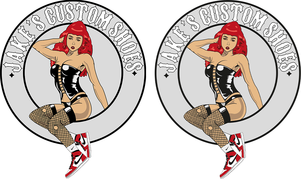
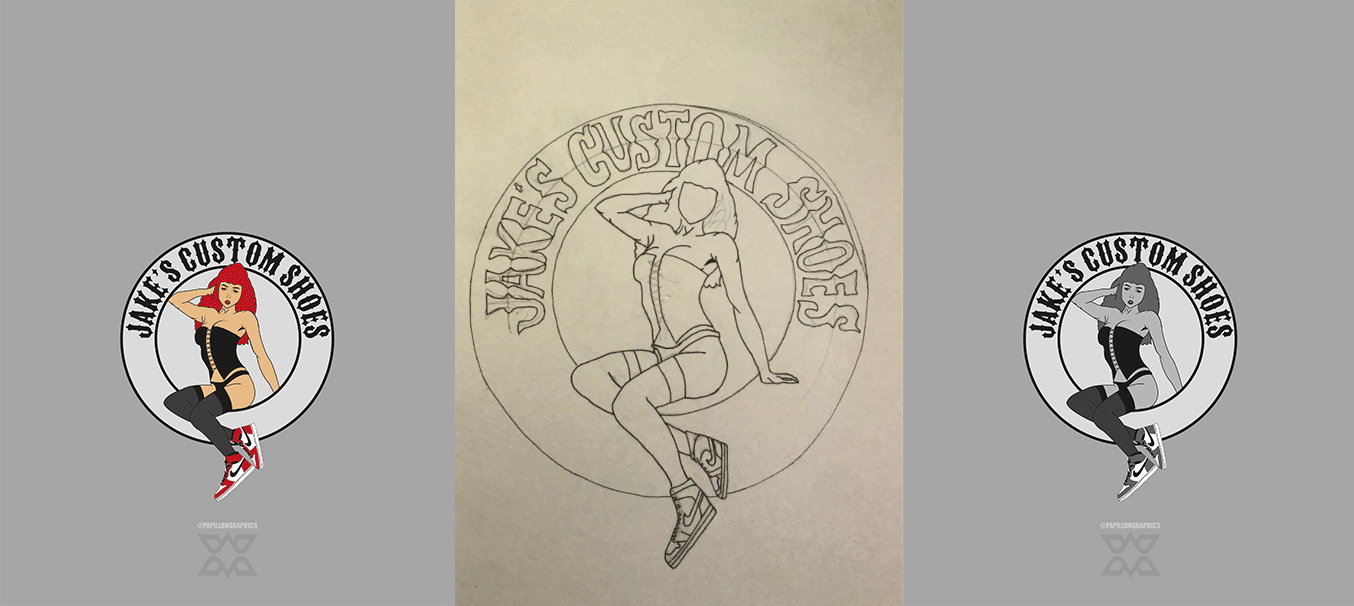
My final logo idea came from talking to Jake and hearing he likes old fashioned style artwork, and my passion are pinup art came played its part. I began sketching and drawing circles with household objects as I couldn’t find a compass to help. I took a long time deciding on a typeface, but I found a commercial use biker theme typeface that I wanted to use. I spent weeks changing little details knowing this would be printed on T-shirts and Jumpers. I would constantly be seeing the imperfections as this logo is more of an illustration compared to other logo designs I have done in the past.
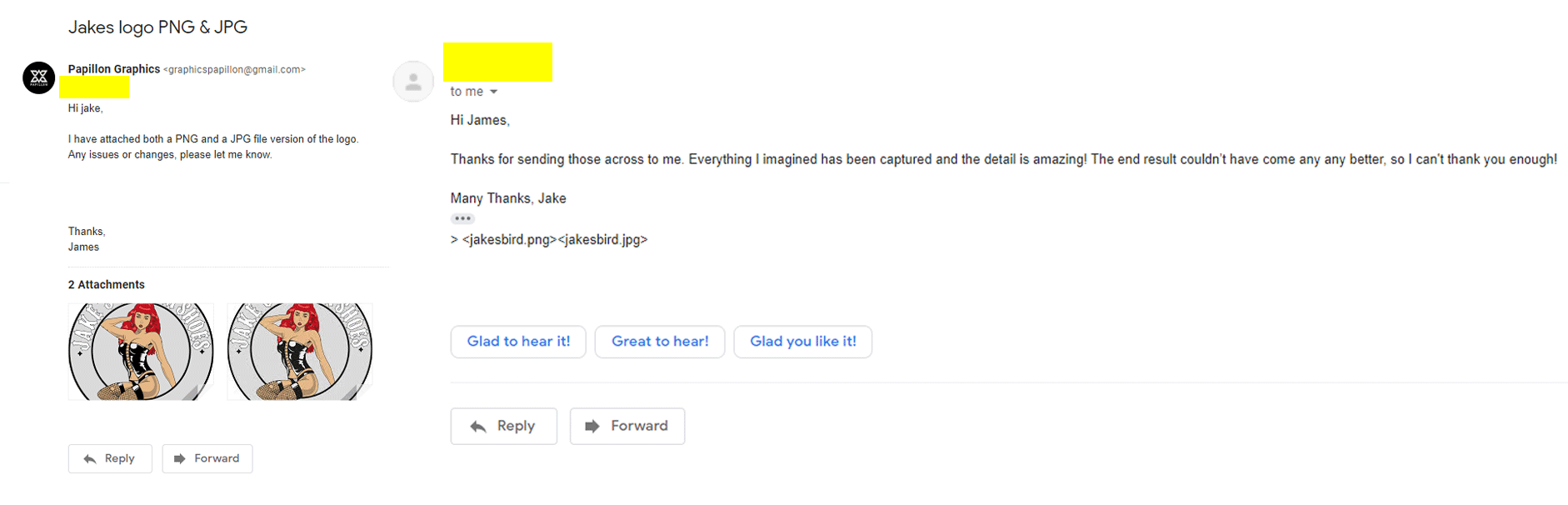
This is my communication after the logo was designed. Unfortunately due to the current pandemic, I was unable to give the business their logo via USB stick. This is my preferred way of completing the transaction, I feel getting something physical in return makes the buyer feel more satisfied and I get the piece of mind knowing the file isn’t compressed, lowering the quality of the final design.